
UX Case Study
Role
Senior UX Designer
Timeline
10 weeks · 2025
Team
Platform
iOS & Web

01 — Overview
Users were constantly leaving feedback about the complexity of finding orders and items in Purchase History. What should be a simple task turned into a sprawling five-step process, each screen adding friction without adding resolution.
Our team set out to understand what Pros are looking for — not just where. That meant starting with questions, and understanding our users.

02 — THE USER
Our B2B customer or our "Pro" account holders are complex.
There are multiple roles within an account, whom all have different tasks and goals when it comes to how they utilize Purchase History and what they're looking for. Not only are there the people working on a jobsite, but there are also people behind the scenes who visit Purchase History on a regular basis.

Project Oriented

Business Owner

Project Manager

Procurement Manager
Order Oriented

Site Supervisor

Site Sub-Contractor

03 — Research
We utilized three different data collection strategies to understand the whole picture.
Numbers could tell us what people were doing in purchase history search — where they dropped off, which filters got ignored — but not why. So we paired that data with real user feedback to fill in the gaps.
Search Metrics
Page Level Survey
Customer Listening Sessions
04 — DATA-DRIVEN
The previous most utilized search fields were Item Description, PO/Job Name and Total Amount. Which gives us a good indication of what is important, but we were still seeing a healthy amount of usage in other fields such as Total Amount and Order Number.
We didn't want to ignore these numbers, but didn't know why these fields were important to users or how they were using it.


05 — USER INTERVIEWS
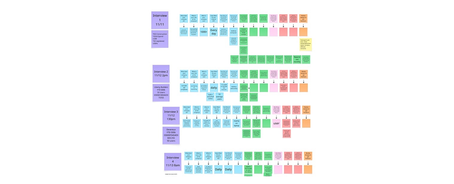
Here's what we learned - each Pro account holder has different tasks when they come to Purchase History. Project Managers use the invoice number to reconcile their statements with Purchase History. While Procurement Managers need to find a previous item to repurchase for a job.
We learned that ultimately, we need to provide a flexible but simple solution for order and item findability.

07 — USABILITY STUDIES
Each iteration was validated against the same tasks, so we could see friction fall session by session rather than guessing.
By the final round, users completed both searching and filtering by different fields without confusion providing us the solution that fits the need for every role in the Pro account.z
08 — OUTCOME
The clearest solution was providing a simple search bar experience for multiple outputs, rather than pre-selecting one field.
Users praised the clear and concise search experience, and providing filters that actually help them accomplish their tasks.


09 — Impact
Searches per visit
Showing an increase in accuracy
Engagement Ratios
Measured over first 2 weeks
Increase in Order Details Visit
Reflecting high query relevance
Search & Filter Feedback
Measured over first two weeks
10 — Reflection
The redesign shipped, but the more lasting outcome was how we understand our Pros.
01
Keep it simple, follow patterns
After multiple iterations of different advanced search designs, the one that led to the most success was a simple yet robust search experience. Keep in mind what patterns our users are used to across other experiences.
02
Trust is a design material
Users didn’t want fewer search fields — they wanted to search easily and with accuracy. We need to provide user trust by providing them with the information their looking for and knowing their tasks.
03
Every Pro is different
Our improved metrics show that flexibility, accuracy and simplicity win. We looked at the whole picture of the account users, not just the hard data.
